The Ritz-Carlton Unveils New Logo and Color
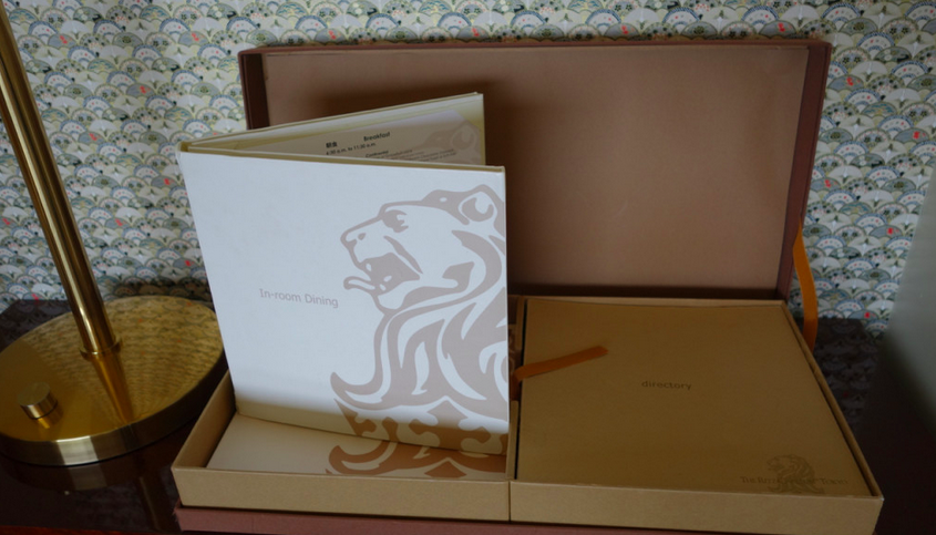
The iconic Ritz-Carlton logo synonymous with luxury has remained unchanged for the past 32 years. In 1965, the owners of the Boston property created the famous lion and crown logo symbolizing “elegance, refinement and noble bearing” that is known around the world today. The logo graces everything from Marquees, towels and coasters to in-room dining menus.

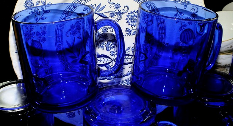
One of the other things that has remained the same is the cobalt blue color used in conjunction with the logo.
Where did the blue color come from? According to their website, homeowners in the 1920’s imported glass from Europe and when it came into contact with the air in Boston it surprised everyone by turning blue. The calm-hued glass color quickly became popular and a symbol of affluence. The hotel decided to order a cobalt blue chandelier for their ballroom, and the rare color stuck. Today, many Ritz-Carlton properties still lay out glasses in the cobalt blue hue.
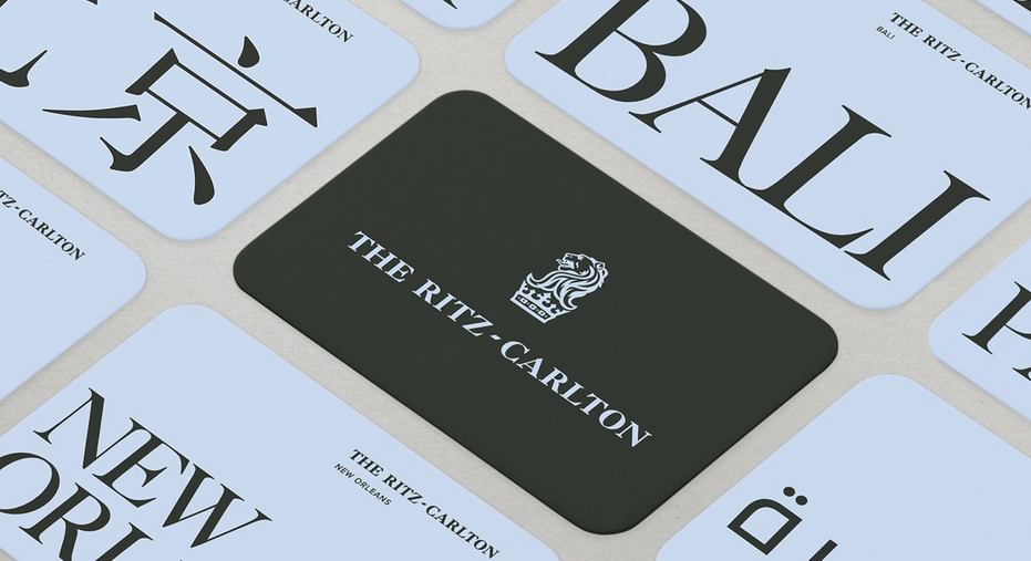
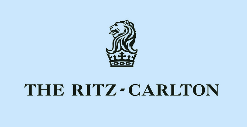
As part of the logo refresh, the color changed as well. Shifting from a deep blue to a lighter color slightly reminiscent of a robin’s egg, the Ritz-Carlton hopes that the new color will continue to be a marker for excellence.
Here’s a video about the logo refresh –
Ed French, CMO for The Ritz-Carlton said, “As a brand that aims to lead the way for luxury, we didn’t wait for emphatic data to tell us there was a problem to fix. Instead, we took a leadership point of view and conducted global studies, not on where luxury has been, but where it is going – to shine a light for the others to follow.â€
Here’s the old logo –
Here’s the new logo –
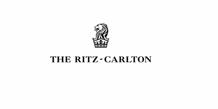
It’s nothing drastic, and when I first saw the change I wondered if I had made a mistake and clicked on the old one again. I don’t know what I was expecting, but was a little surprised to see that the lion and crown were still there. It makes sense though, since it is an easily identifiable logo all over the world. To change it completely into, say, a hummingbird with a necklace wouldn’t carry the luxury chain’s history.
Here’s the new logo with the new blue background –
What do you think of the Ritz-Carlton’s new logo?

Frankly I prefer the old one. The smaller font was more elegant in my opinion. Just personal preference I guess.
Elisabetta, the font jumped out to be as being more modern and less elegant as well. Thanks for reading!